With 72 percent of American adults engaged with at least one kind of social media platform, social media play a crucial role in enabling communities online to engage and share information[1]. While Instagram remains one of the most used platforms with around 1.4 billion global users [2] The options to post content on Instagram have changed over the past few years. The Bookmarking feature used for collecting and organizing launched in 2016 has stayed over the years[3]. Instagram-saved content is also being recognized as a metric for engagement as it is a strong indicator that the user resonates with the content more inquiry and research are required[4]. However, navigating and accessing content from the bookmarked collection can lead to a complex experience since there is no sorting or searchability features making it easier for accessing the saved collections and the addition of newer content. My project focuses on exploring the current methods applied by daily Instagram users for saving and accessing saved content.
The Networked Knowledge Activities (NKA) Framework [5] articulates and describes the six discrete knowledge activities that people use in networked online contexts (e.g., online classes, social media, virtual communities of practice). The NKAs support three main knowledge functions: management, communication, and creation [6]. Collecting and curating are both forms of knowledge management. Curating and constructing both are forms of creation. While these are fluid and interconnected in action Information seeking is one of the common themes identified by Anita after reviewing popular frameworks for why people use social media.
To find out how people use Bookmarking on Instagram I asked the audience on Instagram directly by posting on my account. While I received over 10 responses I was able to find the subset of people that felt more connected with the area by sending them a pre-interview document highlighting the areas we will be conversing about in the interview. I was able to conduct 5 Semi-structured interviews that lasted a duration of 30- 35 minutes.
I conducted semi-structured interviews since they helped explore a sequence of themes and phonemes from the participant's point of view while allowing flexibility to explore any particular aspect that I may find interesting during the process. One interview was conducted in person while 4 interviews were conducted using the Zoom video platform.
Pic from Zoom
After multiple rounds of coding and comparison, I was able to deduct 6 categories under which the codes could be categorized. The codes within each other category and categories themselves were compared to
While 4 of 5 participants shared that they have more than one account on Instagram. The second account is often a burner account or finsta or a bit of both. The participants expressed the content consumption change in the second account is one of the reasons for a secondary account. In some cases, participants expressed that the secondary account often has more content that is bookmarked since a lot of the content they follow is of influencers or stuff they find important to their personal consumption.
“I'm also an artist on this side. So I save a lot of like art inspiration also because I have Instagram accounts for different reasons. So one Instagram I just use for social purposes and the other one is my on Instagram, and one is kind of like a finsta. I don't want to call it a finsta, but it's just like where I post random other things not like troll content, just like other things. So on every account, I see different kinds of things.”
Since the inquiry in the study is rooted in qualitative inquiry, I understand that qualitative research is diverse and ever-evolving. Therefore I triangulated data with multiple data sources including but not limited to the literature knowledge I uncover along with the engagement with participants in various contexts through interviews, generated codes, and reflection against my own biases. The study also has potential limitations with regard to transferability since the key findings and results are limited to the sub-group I have Identified and engaged with. The knowledge may not be credible and consistent since it requires a much more comprehensive inquiry, time among other resources. Despite the limited scope of the study highlight some of the challenges experienced by daily users and exemplify the need for Research and design of novel design systems. Much can be done by Instagram with regard to making the platform more accessible to these experiences.
Fitness trackers, also known as fitness bands or activity trackers, are becoming immensely popular. Unlike a decade ago, the market has been flooded with a diverse range of Wearable Fitness Trackers (WFTs), to suit every budget. WFTs are most commonly used to track fitness related metrics such as steps walked, calories consumed, heart rate, and oxygen saturation. However, WFTs are not only for Chad and Brad, the two gym buddies who you see hogging the machines at the gym. They can be a great accessory for anyone wanting to introduce some sort of physical or mental health into their life.
After synthesizing the findings from the market research, competitive analysis, secondary and primary research our team has had two key takeaways
The average homeowner has little to no experience with Augmented Reality applications. Many of the interviewees had a beginner to intermediate level of experience in AR. The interviewees thought that having AR would have definitely helped them with their home renovation.
Users having the ability to customize was extremely important. This interviewee has inspiration, but there were many decisions to make, so having a visual of the bathroom would have been extremely helpful.
The PUX team interviewed six individuals in the proposed user group, all of whom had experience making large purchases through home remodeling applications. Along with the interviews each member in PUX picked an AR app to evaluate identify the qualities of other AR apps that the team considered useful and which qualities should be avoided when designing an AR bathroom remodeling experience. The team planned to gain a better understanding of what users actually look into when they start from the very beginning of their interest in purchasing a shower.
What exactly are they trying to customize?
Why is it essential that they get this sense of customization?
What would make them comfortable and provide them a sense of finding what they need?
Using this newly solidified user group and building upon pain points discussed by interview participants, the team fit UpHome’s application into a journey map. This details the user’s experience even before using the application, showing how their needs guided them to the application and to eventually buying a shower.
Because the main focus is to design a flow of how users will make their personalized decisions, the PUX team aims to reduce choice overload.
This is done by segmenting different shower accessories into their own sections. Within a section, the user can choose a product.
Once a product is chosen, it will be displayed in AR above for real-time updates. A toolbar was included for ease of use. Users may jump back and forth between accessories.
Because the main focus is to design a flow of how users will make their personalized decisions, the PUX team aimed to reduce choice overload. It was crucial for the project to include AR shower models that communicate the idea and flow of customization to the stakeholders however Augmeted reality is a complex task. I companioned prototyping stage of the AR shower models. The prototypes were used at several stages of the design process which include evaluation, video walkthrough, and concept validation.
The team used Whimsical to start designing early Lo-Fi prototypes to better understand each other's findings as well as get an idea of where to start when it came to testing and then further development into mid-fi prototypes. The team conducted this by each designing the basic screen layout in order for their version of the app to function, which was developed from their overall findings. This led to them discussing and deciding which pieces to move forward with when testing and further development. The team asked the interviewees to select a specific part of a shower they would like to edit and explained how they would make changes to their shower. Interviewees were asked various questions on how to navigate the application and where they think they would find specific icons.
Originally, the team had only created the showerhead customization screen (shown to the right) and attempted to conduct a bodystorming activity. With the takeaways the team received, they decided to make multiple different customization screens to allow for an actual application walkthrough to hand over to UeGroup and Uphome.The other customization screens stemmed from what users in the user group said they would like to see on a shower customization application. The new screens are shown below
To understand the flow of the shower customization process and understand the interaction of the augmented shower model in a physical space which is where the AR solution is meant to take place the team conducted a body storming activity the takeaways from this activity include the need for more iterations in mockups to communicate the design along with the consideration for a UI that supported Landscape mode for the application. The team collaborated with the sponsor, Sarah Field, to discuss the most viable option for user testing. The sponsor decided on the Likert scale testing and created a protocol that addressed tasks throughout the application. The team then tested with five users in the proposed user group
It was difficult initially to balance the course work and the tight schedule since this was my first UX project at PUX moreover things worked differently because of the pandemic which took time to get accustomed to. However, I was able to learn quickly and ration my time among my course work and contribute to the PUX team. I was able to champion stages of the design process, most notably Prototyping the Augmented Reality Shower models, body storming evaluation method. Throughout the project, PUX was lucky as we were able to frequently reach out to our Professors and the sponsor of the project for feedback. The best part about the experience was UpHome saw value in the proposed solution and even implemented the design onto their website.
Fitness trackers, also known as fitness bands or activity trackers, are becoming immensely popular. Unlike a decade ago, the market has been flooded with a diverse range of Wearable Fitness Trackers (WFTs), to suit every budget. WFTs are most commonly used to track fitness related metrics such as steps walked, calories consumed, heart rate, and oxygen saturation. However, WFTs are not only for Chad and Brad, the two gym buddies who you see hogging the machines at the gym. They can be a great accessory for anyone wanting to introduce some sort of physical or mental health into their life.
Help reduce the choice overload of first time users renovating their shower Create a customization process that would reduce the need for prior shower remodeling knowledge Visualize how augmented reality would fit into the customization process so to help customers get a more comprehensive view of their new shower
The team planned to gain a better understanding of what users actually look into when they start from the very beginning of their interest in purchasing a shower.
What exactly are they trying to customize?
Why is it essential that they get this sense of customization?
What would make them comfortable and provide them a sense of finding what they need?
The PUX team interviewed six individuals in the proposed user group, all of whom had experience making large purchases through home remodeling applications. Along with the interviews each member in PUX picked an AR app to evaluate identify the qualities of other AR apps that the team considered useful and which qualities should be avoided when designing an AR bathroom remodeling experience.
Using this newly solidified user group and building upon pain points discussed by interview participants, the team fit UpHome’s application into a journey map. This details the user’s experience even before using the application, showing how their needs guided them to the application and to eventually buying a shower.
Because the main focus is to design a flow of how users will make their personalized decisions, the PUX team aims to reduce choice overload.
This is done by segmenting different shower accessories into their own sections. Within a section, the user can choose a product.
Once a product is chosen, it will be displayed in AR above for real-time updates. A toolbar was included for ease of use. Users may jump back and forth between accessories.
But I must explain to you how all this mistaken idea of denouncing pleasure and praising pain was born, and I will give you a complete account of the system, and expound the actual teachings of the great explorer of the truth, the master-builder of human happiness. No one rejects, dislikes, or avoids pleasure itself, because it is pleasure, but because those who do not know how to pursue pleasure rationally encounter consequences that are extremely painful. Nor again is there anyone who loves or pursues or desires to obtain pain of itself, because it is pain, but because occasionally circumstances occur in
Help reduce the choice overload of first time users renovating their shower Create a customization process that would reduce the need for prior shower remodeling knowledge Visualize how augmented reality would fit into the customization process so to help customers get a more comprehensive view of their new shower
The team collaborated with the sponsor, Sarah Field, to discuss the most viable option for user testing. The sponsor decided on the Likert scale testing and created a protocol which addressed tasks throughout the application. The team then tested with five users in the proposed user group.
It was difficult initially to balance the course work and the tight schedule, since this was my first UX project at PUX moreover things worked different because of the pandemic which took time to get accustomed. However, I was able to learn quick and ration my time among my course work and contribute to the PUX team. I was able to champion stages of the deign process, most notably Prototyping the Augmented Reality Shower models, body storming evaluation method. Throughout the project, PUX was lucky as we were able to frequently reach out to our Professors and the sponsor of the project for feedback.
Fitness trackers, also known as fitness bands or activity trackers, are becoming immensely popular. Unlike a decade ago, the market has been flooded with a diverse range of Wearable Fitness Trackers (WFTs), to suit every budget. WFTs are most commonly used to track fitness related metrics such as steps walked, calories consumed, heart rate, and oxygen saturation. However, WFTs are not only for Chad and Brad, the two gym buddies who you see hogging the machines at the gym. They can be a great accessory for anyone wanting to introduce some sort of physical or mental health into their life.
The initial problem framing has provided multiple areas of focus. To narrow down, we first identified stakeholders who are being adversely influenced by the existing design of grocery shopping experience.
Considering types of stakeholders
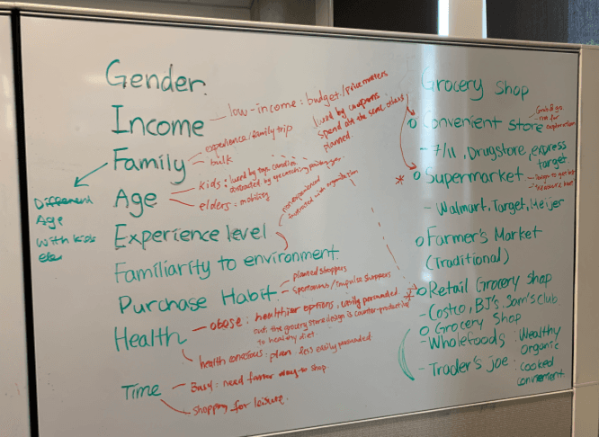
The Types of stakeholders considered are characterized by gender, income level, family structure, age, familiarity to the shopping environment, purchasing habits, health profile and time. The image below demonstrates the analysis of the groups of shoppers with different attributes and ways they could be negatively impacted by the existing experience of grocery shopping.
The stakeholder analysis suggested two most vulnerable groups: 1) People who are at higher risk of health concerns due to unhealthy diet.
2) Populations who struggle navigating through the stores because of mobility issues. Grocery stores use tactics in its layout design to encourage shoppers to walk around the store, which makes people with mobility issues difficult to access basic grocery items, for example milk and eggs are being placed at the end of the store.
The Struggles: an inability to make healthy dietary choices While supermarkets provide cheap, but less healthy food options. The persuasive design of supermarkets gives people who already have poor dietary patterns a hard time to adopt healthier purchasing patterns. Shoppers need to have strong will-power to resist the temptation to grab unhealthy food options that are promoted to them in the store.
We identified key takeaways from our primary and secondary analysis
It is challenging to break consumers’ grocery shopping patterns as it is the accumulation of lifestyle that has been learned from their past food gatekeepers and settled with their current life patterns. Changing the complete pattern of the shopping routine and eating habits is unrealistic and it is hard to keep it long-term. Nudging is an attempt to change the behavior or interaction in different directions without using financial incentives while still suggesting the choice to the user.[1]. Our approach is to gradually introduce consumers to healthier dietary choices with nudges by suggesting items into their shopping list.
We brainstormed into several ways these nudges can be implemented into the current grocery shopping pattern. Upon further discussion and further ideation, we narrowed down our idea to implement little design nudges into the shopping cart, which is always present with the majority of the shoppers at the time of shopping. To understand nudges further we researched several kinds of nudges and found cognitive oriented, affective and behavior nudging were popular among the current researchers for nudging people to eat healthily. We tried to implement these nudges in several areas of our design.
But I must explain to you how all this mistaken idea of denouncing pleasure and praising pain was born, and I will give you a complete account of the system, and expound the actual teachings of the great explorer of the truth, the master-builder of human happiness. No one rejects, dislikes, or avoids pleasure itself, because it is pleasure, but because those who do not know how to pursue pleasure rationally encounter consequences that are extremely painful. Nor again is there anyone who loves or pursues or desires to obtain pain of itself, because it is pain, but because occasionally circumstances occur in
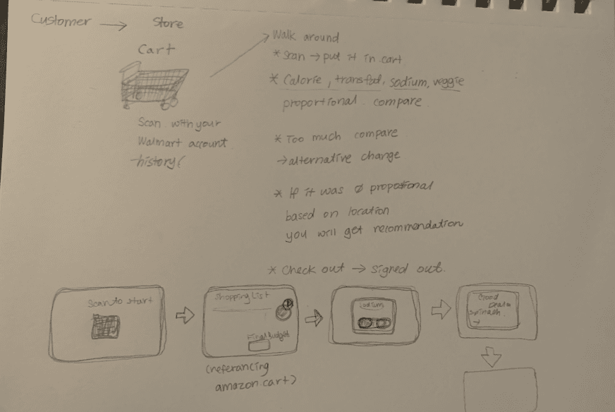
As the user travels through each section and aisle, the cart will nudge users to grab the closest healthy grocery items that’s listed on the grocery list. For example, as the user walks past the fresh vegetable section, the cart will vibrate and a pop up screen shows up, shown below.
If the user picks up the suggested item, then the user can simply scan the item with a barcode scanner built into the screen on the cart, and the cart will record this food item as “added to cart”. If the user decides to not purchase the item on that day, they simply tap “dismiss”.
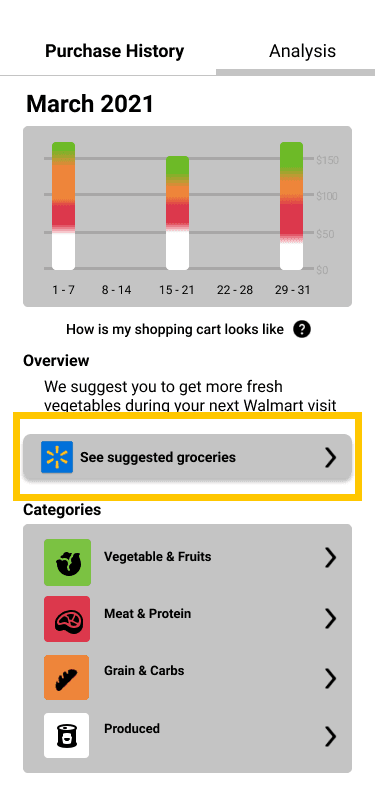
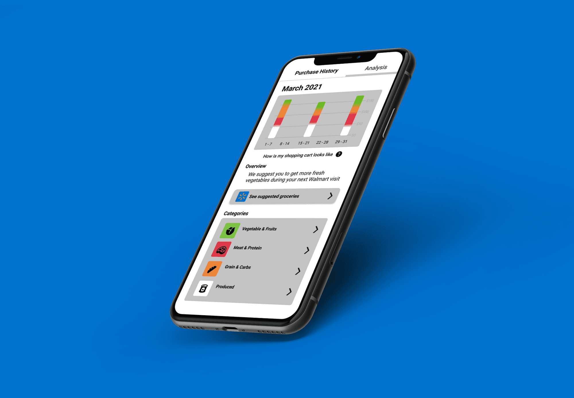
The final nudging design intervention is the dietary pattern analysis showing the user’s dietary pattern progression over a period of time. This feature is meant to help users to be more aware of their shopping patterns, and visualize the effort they are making in working towards a healthy eating habit.
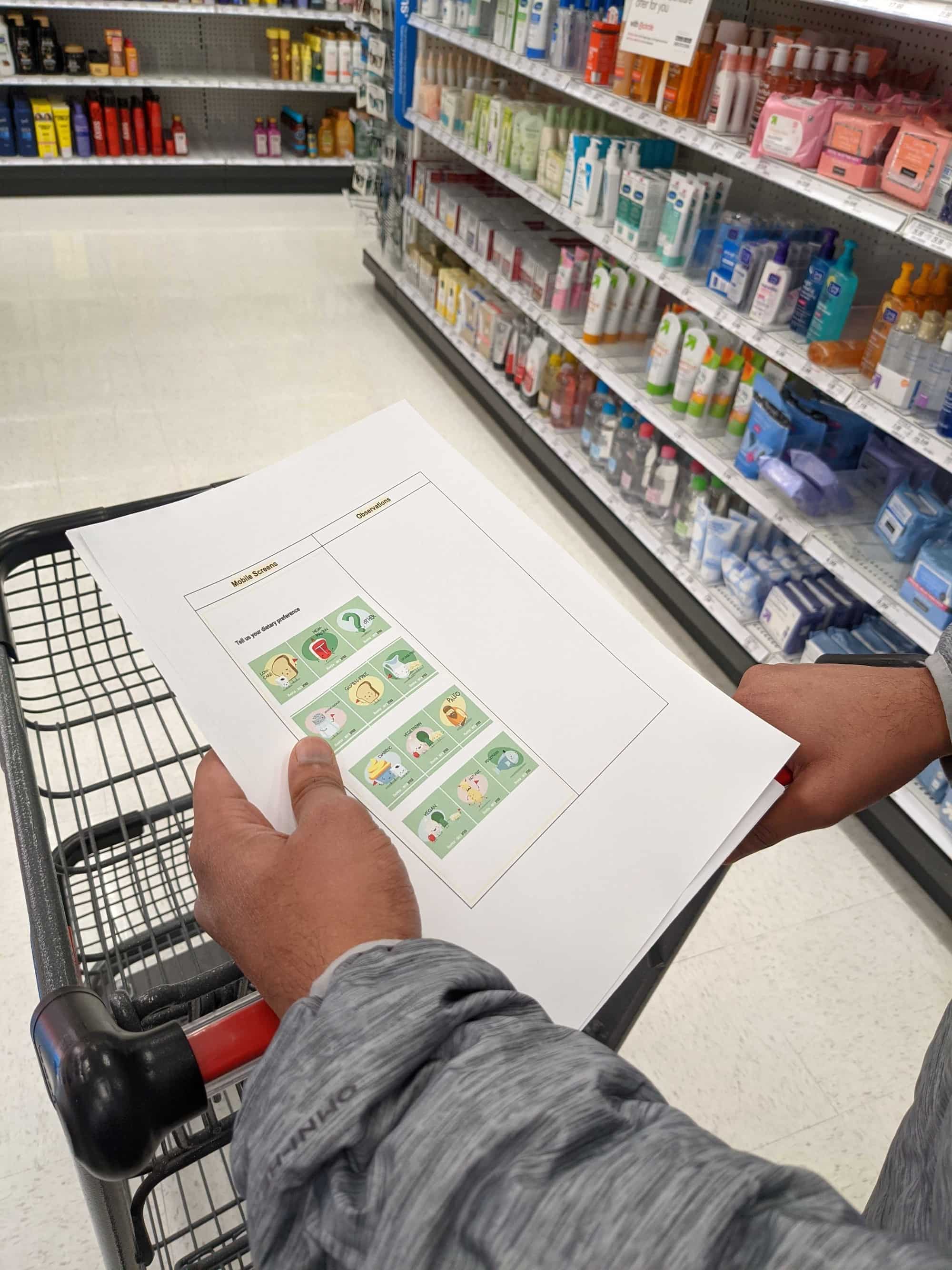
To evaluate the design solution we did concept testing on two individuals, the aim of the concept testing was to see the willingness of our user group to accept the design and the task flow for mobile and cart screens. For the second round of evaluation we conducted an in-grocery story inquiry on one young adult (as the images shown below). The goal for this evaluation was to observe shoppers in the grocery store while nudging/encouraging while shopping. The evaluation was carried out by using the mockups as screens for a tablet device while the researcher suggested food options based on the shopping preferences that were notified by the shopper before the start of shopping.
There are several limitations that can be accounted for in the proposed design idea. Given the limited time and resources, we defined our scope in the attempt to focus on user welfare, without restricting ourselves with other parameters such as money or feasibility of the idea with Walmart which is complicated and would distract the focus of the project. This would make tangible solutions that are feasible.
From our research we have identified nudging as an effective method for encouraging healthy grocery purchase. However further research can be done into identifying the most appropriate occurrence for nudging, so that the nudging in store wouldn’t be too frequent to shoppers, so that they found it to be a distraction or irritation.
For the majority of the project, we focused on the shoppers welfare and designed our solution based on it without being too much restricted to the store’s profit and feasibility. We do think implementing our design would lead to brand loyalty in the customer base, learning from the Starbucks and Amazon Prime subscription model.
Our solution emphasizes bringing a personalized shopping experience to Walmart shoppers, and it is under the condition that users would be willing to share their dietary preference data, past purchasing and link account information with the store smart cart. Therefore, data privacy and access would be a crucial point that needs to be taken into consideration in the future.
Fitness trackers, also known as fitness bands or activity trackers, are becoming immensely popular. Unlike a decade ago, the market has been flooded with a diverse range of Wearable Fitness Trackers (WFTs), to suit every budget. WFTs are most commonly used to track fitness related metrics such as steps walked, calories consumed, heart rate, and oxygen saturation. However, WFTs are not only for Chad and Brad, the two gym buddies who you see hogging the machines at the gym. They can be a great accessory for anyone wanting to introduce some sort of physical or mental health into their life.
Wearable Fitness Trackers (WFTs) have almost become a go-to gadget for evaluating and encouraging a healthy, active lifestyle. However, their success as an effective intervention to influence behavioral change is yet to be explored fully. Even though our desk research showed several suggestions on how collaboration between developers and behavior change experts can produce favorable interventions, there wasn’t a system that provided a complete solution. We pick up from the suggestions made by Alycia and Margie, “advances are still needed to help inactive individuals determine how, when, where and with whom they can increase their physical activity” (2017). Furthermore, our interview insights point to several reasons why exercise does not piece into our users routine:
To answer our design question and gain a better background knowledge about our design challenge, we conducted secondary analysis on 4 keys assets of staying for a healthy lifestyle.
Based on our secondary research findings, we narrowed down our user group to people who work behind desks since they usually face the most important barriers to being active such as time, energy and motivation.
To verify our research, we interviewed 6 adults, working a 9–5 job. We chose a mix of professions to better understand what a typical day looks like, their past relationship with exercise, and whether they have used a fitness tracker before.
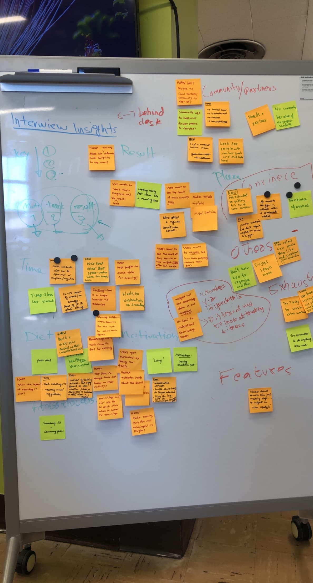
We created an affinity diagram to organize, and consolidate our insights from the interview. Grouping them according to their similarity we broadly identified time and place as the two underlying reasons for user demotivation. After identifying priority pain points through affinity diagramming, we transformed these concepts into questions, considering the underlying factors that may be driving them.
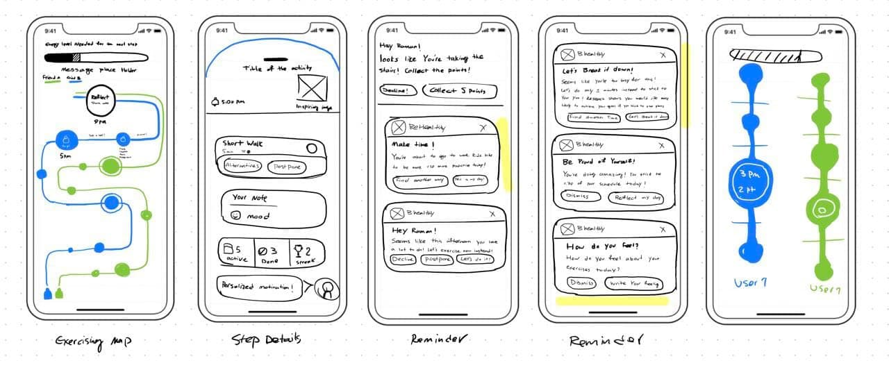
Taking inspiration from the 21-day habit building challenge, we borrowed the strategy of goal setting to motivate individuals. Moreover, informed by our insights we employed other strategies such as eliminating environmental hurdles, feedback, and rewards.
The exercises require no prior experience, equipment and can be done anywhere. To further enhance the user’s experience, we incorporated a tree sapling that nurtures and grows as the user completes their daily exercises. It is to give them a companion to take care of, to give them a feeling of self-importance.
To evaluate our application, we conducted a Usability Test. We chose this method for two reasons; one, to help us test the 21-day habit building challenge and two, to judge whether the language, application flow, and exercises were easy to understand. The main questions we wanted to address were (Full evaluation protocol along with notes can be found in the Resources section).